Webster’s Dictionary defines the word “logo” as “a symbol that is used to identify a company and that appears on its products.” To you and me, this is a logo:
![]()
So is this:
![]()
And this:
![]()
These little images are simple, clean, elegant and, most importantly, evocative. The good ones are immediately recognizable as a product or a brand, most without even a hint of text. The great ones; those stir a feeling. All of these logos also have something in common: they all feel like they were “created” in about five minutes.
![]()
These days probably one of the most iconic and instantly recognizable logos is Apple’s. Just take a look at the image above. (Ignore the purple thing. It’s something known as the golden ratio and that’s not really the deep, dark design hole we want to jump down for this discussion.) Instead, look closely at the construction. Other than a couple of odd lines, the Apple logo is cut and crafted from just a few circles. Simple, right? It probably took the designer about five minutes to do.
Except it didn’t.
Here’s the thing with logo design: it’s so much more than the markings on the paper or the pixels on the monitor. While the majority of logos are just a few circles and lines, the real value is in the process. Crafting those basic elements into perfect, iconic shapes and proportions is a process—and it’s where logo design actually happens.
Let’s explore that process through a real-world example and see what exactly goes into this five-minute task.
The Brief
We have recently converted our Arcweb Technologies newsletter into a monthly email publication and podcast called Product Hacker. In order to establish it as its own branded thing, the design team was charged with creating a logo for it, its web presence and its promotional materials.
Building a digital product?
We began the process by thinking. As expected as that sounds, thinking through what a design needs to convey and represent is critical (and often overlooked). Before a single pen is put to paper or a pixel has been pushed, thought is required. Sometimes that’s conducted by a single designer. Sometimes it’s a design team. Sometimes the client participates—thought too many cooks in the kitchen can lead to designs like this:
![]()
In any case, a thoughtful beginning to the process resulted in an objective for the Product Hacks logo:
Represent the concept of creating a digital product and altering it in impactful ways.
Sketching
Once we had some ideas, we began sketching them out. To most designers, this is the fun part and the meat of the process. There are really no guidelines here; just put to paper all of those random thoughts. Some drawings will be crude, some detailed, but mostly this part of the design process will give you a quick take on what works, what doesn’t and which concepts you need to develop further. Here’s what this discovery step looked like for the Product Hacks logo:
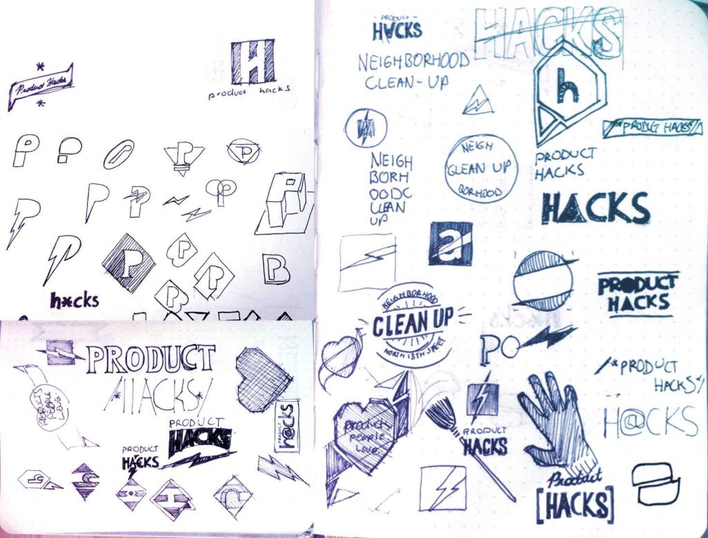
This should begin to highlight how logo design is not a “sit down and create the most perfect and awesome logo in five minutes” exercise. Creating a ‘simple’ logo is far from simple. It’s a very iterative process that requires a lot of thought and work at nearly every step of the way.
As we amassed close to 100 concept sketches, we started to notice some cool ideas and interesting shapes and patterns. That signaled to us that it was time to take the next step in the process: concept development.
Building a digital product?
Concept Development
Here is where we began to pull the best concept sketches to be fleshed out in a design application. While we often sing the praises of Sketch, Adobe’s Illustrator was our choice here mainly because its vector editing and powerful shape tools are unmatched.
As with the other steps of the process, concept development is not a one-and-done exercise. While sketching is a great way to get concepts down on paper, the looseness of a sketch doesn’t always make for a good digital design. With sketches, your brain fills in a lot of holes. This is why great sketches don’t always produce great finished products.
Developing concepts in a digital environment fosters fast iteration. Simple functions like copy, paste, undo and redo allow for quick and easy experimentation that leads to lots and lots of design concepts.
Here’s what the initial concept development process looked like for Product Hacks:
![]()
The first round of concepts produced some amazing and varied results. You can see how the sketches inform the designs, but also how little tweaks to a core design can lead to interesting new takes and directions. You can even see the initial seeds of the final logo starting to take shape.
Discussion
Review is the next part of the process and it can vary wildly from project to project. Sometimes, you want to involve the client and take them through each design and really pick their brain as to what they like and don’t like. Other times you do this internally, with other designers or even strangers off the street. A good design will speak to all kinds of people and you can quickly get a feel for what works and what doesn’t.
Since we had a lot of design concepts for Product Hacks, we knew the choices could be overwhelming. Putting 30-some logos in front of a client (in this case our CEO and the marketing team) usually ends up being counter productive so we took a different approach. We decided that these early discussion and vetting stages would happen with just the design team. We would pare down, rework and refine the designs until we had the perfect one. Here you can see we did a hefty amount of refinement and really focused on the designs that encompassed the feel of Product Hacks captured in the objective:
![]()
Now that we had a much tighter set of designs, we really honed in on what made each one special. Through extensive discussions, doodles, and Slack chats, one logo concept kept coming up over and over:
Why did this one keep making the cut? In short, it’s because it had a strong, simple design, good typography and could easily work as an icon without any of the text.
But We Were Not Done Yet
Despite nailing down a final look, we still needed to do another pass to really explore the potential of the design. Were the colors right? Could we do more with the type? What about flipping the whole thing? These hidden questions are part of the design process logo consumers do not see in the final product.
![]()
Nailed It
Despite the additional explorations, none of them really made the initial design much stronger, so we left them on the cutting room floor. (Side note: It’s important to recognize when additional exploration is exhausted. There’s no definitive answer, but quality design teams know it when they see it.)
With a final polish pass we updated the colors to tie the new brand to Arcweb Technologies without having to slap our name on it like a bad bumper sticker.
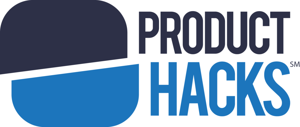
The Pitch
With logo in hand, we approached the final step: convince the marketing team and most importantly, our CEO Chris Cera, that this was the new look for Product Hacks. A couple of our pitch points included…
The new logo perfectly embodies the objective of Product Hacks.
The simple and strong design quickly makes a statement.
The iconography suggests “digital product” with an app icon that could also be seen as a button.
The slash and the offset suggest the hacking of something to make it better and more useful.
The angled slash gives the logo an energy that a straight cut slash would not achieve.
The colors speak to the Arcweb Technologies brand while allowing Product Hacks to stand on its own.
The reaction? The team loved it. But what they didn’t know is that they loved it because of the process; all the behind-the-scenes work that went into producing a “five minute logo.” (It’s worth mentioning that our marketing team knows what goes into quality logo design.)
Any design effort is a journey that, despite the often simple results, takes a lot of time and sweat. The real work lies in the process, and not the pixels.